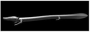
On 13 August l997 Damijan Kracina entered the Postojna caves in order
to photograph the world-famous olm. Accompanied by an employee of Jame,
the company responsible for maintaining and managing the caves, he was
after shots of this rare and mysterious salamander to realize an admirable
idea: To present, both in Slovenia and abroad, a new typeface fashioned
from bodily features of the olm. His enthusiasm was not dampened by the
fact that all his workshop could boast was a 133-megaherz Pentium, 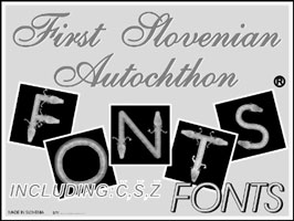 an
unsophisticated scanner and unlicensed Photoshop 5.0. This equipment was
sufficient for the artist to actually finish the intended typeface within
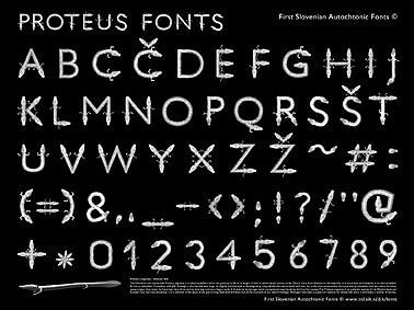
only two months - complete with the Slovenian letters Č, Š, Ž! In
order to speed up the work, Kracina used the humans typeface as a basis,
superimposing on each letter curves, straights and endings fashioned from
the lithe olms. The typeface stands out in particular for its ingenious
finishes based on the heads, forelegs and gills of the amphibian, and
for its characteristic fair color featuring the nuances of human skin,
with sophisticated contrast provided by the gill tips which are bright
red due to the high concentration of blood vessels.
an
unsophisticated scanner and unlicensed Photoshop 5.0. This equipment was
sufficient for the artist to actually finish the intended typeface within
only two months - complete with the Slovenian letters Č, Š, Ž! In
order to speed up the work, Kracina used the humans typeface as a basis,
superimposing on each letter curves, straights and endings fashioned from
the lithe olms. The typeface stands out in particular for its ingenious
finishes based on the heads, forelegs and gills of the amphibian, and
for its characteristic fair color featuring the nuances of human skin,
with sophisticated contrast provided by the gill tips which are bright
red due to the high concentration of blood vessels.
For years the artist has exhibited a vivid interest in endangered animal species (cf. his projects involving the Soča trout or the Tasmanian wolf); it can be claimed that the olm (Proteus anguinus) occupies a special position in his artistic production.
The olm is the only true cave-dwelling amphibian in Europe and, as a
living fossil, one of the most precious treasures of the Slovenian natural
heritage (the animal can be found exclusively in the Dinaric Karst region:
in Slovenia, part of Italy, Croatia, and Bosnia and Herzegovina). The
strife between scientists*  over
this fragile blind creature is another telling example of the endless
struggle of the Slovenian people for recognition and status in the world,
which today they have unfortunately been forced to continue concerning
the, right to the official studbook of the Lipizzaner breed of horses,
too.
over
this fragile blind creature is another telling example of the endless
struggle of the Slovenian people for recognition and status in the world,
which today they have unfortunately been forced to continue concerning
the, right to the official studbook of the Lipizzaner breed of horses,
too.
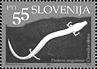
As a newly formed state, Slovenia paid its respects to the small salamander by portraying it on the 10 centime coin and the 55 tolar postage stamp (both released in 1993), and by exhibiting two live specimens at the Museum Salon in Paris (1992). In this light, Damijan Kracina's typeface can be seen as a daring step forward.
 The
artist has opted for the production of an iconographic typeface based
on zoomorphism. This approach enjoyed its highest level of popularity
in the Victorian age, when the primary aim of such typefaces was to draw
attention to the creativity, high-quality of work and attention to detail
of the individual printers, typographers or typesetters. One might jump
to the conclusion that Kracina's work is an anachronism under the doak
of a new medium, but in reality this typeface offers stupendous opportunities
for giving texts an additional dimension of meaning. Naturally, the olmoid
letters are not the most suitable for typesetting school books and textbooks.
But the level of visual culture and national awareness of Slovenian children
can also be raised in another way - what Kracina proposes is an imaginatively
designed set of play blocks (the First Slovenian Autochthon Fonts, made
in Slovenia, 1998). Iconographic typefaces are categorized as socalled
display typefaces. which underscore the importance of a visual message
based on decorativeness. The artist is fully aware of that: In 1997 he
exhibited first in Podsreda and later in Koper an illuminated display
with olms spelling out the word DECORATION. Typefaces are, naturally,
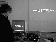
intended for public use; in 1999, Kracina offered to let visitors of the
SIQ show in Vienna try his. With the aid of special software, the individual
symbols, saved as images, appeared on the gallery wall simultaneously
as the keys were pressed, and the words written by the visitors remained
for the artist as a unique book of impressions.
The
artist has opted for the production of an iconographic typeface based
on zoomorphism. This approach enjoyed its highest level of popularity
in the Victorian age, when the primary aim of such typefaces was to draw
attention to the creativity, high-quality of work and attention to detail
of the individual printers, typographers or typesetters. One might jump
to the conclusion that Kracina's work is an anachronism under the doak
of a new medium, but in reality this typeface offers stupendous opportunities
for giving texts an additional dimension of meaning. Naturally, the olmoid
letters are not the most suitable for typesetting school books and textbooks.
But the level of visual culture and national awareness of Slovenian children
can also be raised in another way - what Kracina proposes is an imaginatively
designed set of play blocks (the First Slovenian Autochthon Fonts, made
in Slovenia, 1998). Iconographic typefaces are categorized as socalled
display typefaces. which underscore the importance of a visual message
based on decorativeness. The artist is fully aware of that: In 1997 he
exhibited first in Podsreda and later in Koper an illuminated display
with olms spelling out the word DECORATION. Typefaces are, naturally,
intended for public use; in 1999, Kracina offered to let visitors of the
SIQ show in Vienna try his. With the aid of special software, the individual
symbols, saved as images, appeared on the gallery wall simultaneously
as the keys were pressed, and the words written by the visitors remained
for the artist as a unique book of impressions.
Currently Damijan Kracina is working on an A to-Z promotion campaign for his typeface which will, hopefully, soon come on the market. Thus he will join the still rather small number of Slovenian graphic designers who create their own typefaces and launch them on the merciless international market. There is no fear however, that the olmoid typeface might be neglected or not understood. Through billboards and television, the world of commercials constantly enhances our visual literacy. Literacy has become a relative concept: What was still illegible yesterday is today readable to all. It is clear that Damijan Kracina's typeface is already playing an important part in further raising the level of visual literacy in Slovenia and abroad.

*In the 18th century, the olm was first studied by Giovanni
Antonio Scopoli, physican and natural scientist from Idrija, who presented
it as new genus to the famous Carolus Linnaeus. In his enthusiasm, Scopoli
wished to share discovery with other scientists abroad and sent them specimens
in alcohol even prior to formaly announcing his discovery. Thus it came
about that the Viennese zoologist J.N.Laurenti saw one of these specimens
in the possession of a friend of Scopoli's and proclaimed the discovery
as his own. He named the animal Proteus and reaped the fruit of fame without
having so much as a clear idea of its exact place of origin.
We wish to acknowledge biologist Marko Aljančič for his expert review of the manuscript.
Alenka Pirman
Translated by Tamam Soban
Published by: M'ARS - Magazine of the Museum of Modern Art Ljubljana
Year XII,2000.No.1-2